Beige is not one color. It is a family of undertones hiding inside one paint chip. Your kitchen windows pick which member shows up each morning.
The 15 beige kitchen ideas below treat the undertone like the main event. Each one works with the beige you have instead of fighting it, from paint and counters to hardware and bulbs.
Sample pots cost about eight dollars, and each section states its costs plainly. Start with the undertone, not the cabinet door.
Why Beige Goes Yellow in Real Kitchens

The yellow does not come from the paint going bad. It comes from beige paint with a yellow undertone meeting lighting that leans golden. Together they double the effect, so check the chip against a true white sheet of paper in daylight.
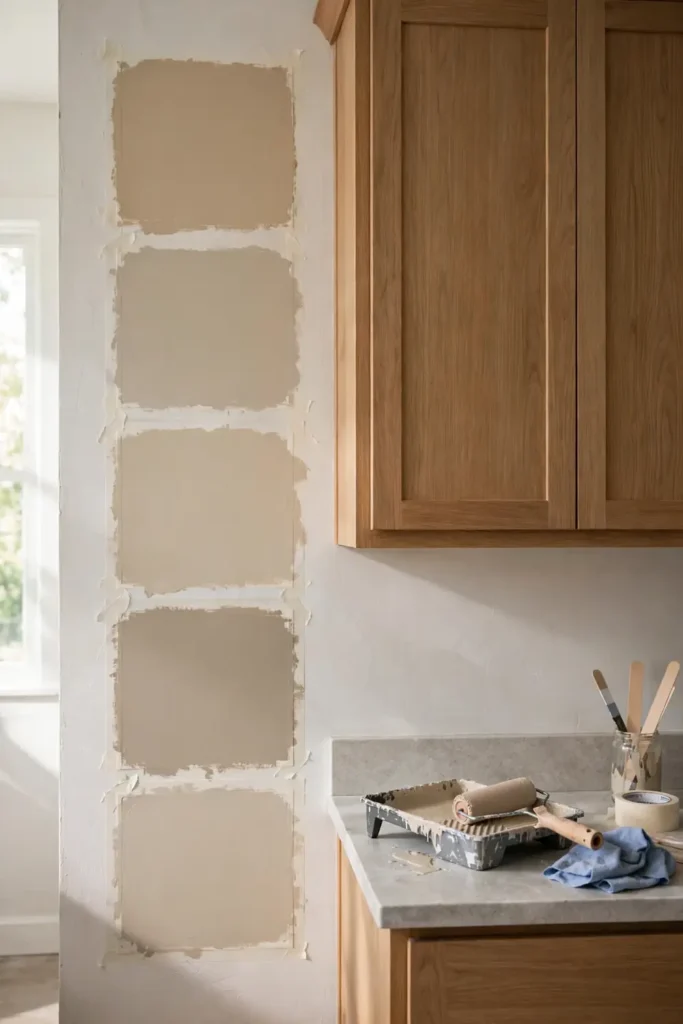
If the beige looks creamy next to the white, the undertone leans yellow. If it looks grayish or pinkish, you are seeing its true family. Paint a large board, not the wall, and move it around the kitchen for two days. Morning light from one side and evening lamps from another change the read, so test morning and evening before committing.
Keep the undertones disciplined through the whole room. Warm beiges belong with warm beiges: mix the families and the room reads muddy, not layered. Pick one family and repeat it.
Sample the Paint or Live With Regret
I once repainted a room in a color my wife loved. Once the furniture went back and everything was styled, the color stopped appealing to me. Repainting meant emptying the whole house again, so I lived with it.
The cost of repainting was not the paint. It was moving the whole house twice. Beige makes this sting worse, because a wrong undertone reads fine on a chip and wrong across the whole kitchen.
A sample pot is the cheapest insurance in the project. Paint it on poster board, not the wall. Move it from window side to shadow side and live with it for two days.
Even a weekend repaint still starts with a sample pot and a patient eye. The board costs a few dollars and an hour. The wrong gallon costs a weekend and your patience.
The Gray-Beige Shadow Under Your Cabinets

Upper cabinets and lower cabinets live in different light. The uppers catch window light while the lowers sit in countertop shadow. The same beige can read two shades apart.
This is where greige goes wrong. A beige with a gray undertone looks balanced on the chip, then turns muddy where the shadow falls. Pink undertones often read softer in that same shadow.
Test the sample where it will actually live. Tape it to the lower cabinet doors and the wall between the uppers. Leave it through a full day of cooking light.
Judge the beige on the lowers first, since that is where it reads darkest.
Quartz or Butcher Block Beside Beige
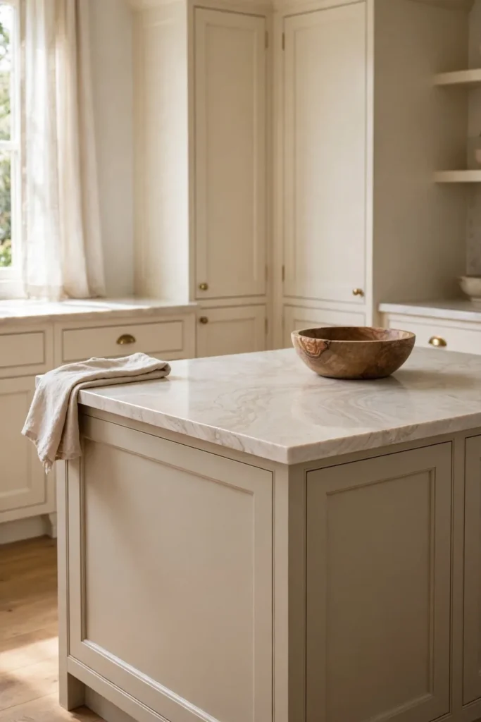
White quartz sharpens beige. The crisp edge makes cabinet undertones look deliberate, and the surface wipes clean with a damp cloth. Pick quartz when your beige leans yellow, since the white counter pulls the eye upward. Butcher block needs oiling a few times a year, which is the real tradeoff.
Butcher block softens beige instead. The grain adds a second natural layer that keeps the room from feeling flat. For a few hundred dollars, IKEA’s butcher-block-style counters beat stone prices. Beige kitchens on a budget usually start there.
Quartz needs no sealing and shrugs off stains. Butcher block costs less, but it marks if you skip the oiling.
Two-Tone Beige Kitchen Cabinets That Stay Calm

Beige lowers with off-white uppers is the calmest two-tone move. The lighter top half keeps the room open while the beige base hides scuffs. Keep both colors in the same undertone family or they will argue. The island can carry a third tone only if it repeats something already in the room, like the floor.
Pick the two chips side by side and squint. If one glows pink and the other glows yellow, walk away. Test the pairing on boards through a weekend of kitchen light, not on the wall. Painting only the lowers costs less than a full repaint, so start there if the budget is tight.
The All-Beige Kitchen Falls Flat

Photos of all-beige kitchens look serene: one cabinet color, one counter, one floor, all blended. The camera flattens contrast, so monochrome looks deliberate online. In person, that same room often reads as one long beige sigh with nowhere for the eye to rest.
Add one dark note and the beige wakes up. Matte black hardware, a dark faucet, or a walnut board on the counter gives the eye an anchor. The usual mistake is adding more beige to fix beige, which only deepens the flatness.
A two-tone version of this fix works on the cabinets themselves. Lighter beige uppers with a slightly deeper beige base stop the room from reading flat. The shift looks calm rather than bold.
Done well, minimalist kitchens prove contrast is the calm you were looking for. One dark element does more than a dozen beige accessories. Restraint with the beige, boldness with the accent.
Sheen Matters More Than You Think

People choose the color, then grab whatever sheen is on the shelf. In a kitchen, that order fails.
Satin bounces light and can make beige look brighter than the chip. Matte absorbs light and reads truer. The sheen changes the color you thought you chose.
Flat paint on cabinets scuffs fast and cleans badly. High gloss shows each fingerprint and each uneven brush stroke. The middle ground survives actual cooking.
Satin or eggshell on cabinets is the common guide for kitchens. It wipes down without glare and forgives small imperfections. Test the sheen on your sample board too, since it shifts the color.
A Backsplash With a Pulse
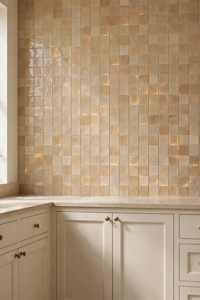
A beige backsplash the exact shade of the cabinets erases the line between them. The wall and the doors melt into one surface, and the kitchen loses its depth. A backsplash should sit a half-step lighter or darker, not match as a twin. Hold a tile sample against the cabinet door in daylight: if tile and door blur together, choose the darker tile.
Handmade-look subway tile does this job well. Each tile catches light a little differently across the wall. Grout one shade deeper than the tile keeps the grid visible without shouting. It is a staple in farmhouse kitchens for exactly this reason.
Your Bulbs Are a Color Filter

Most lighting guides say pick bulbs last. That advice is incomplete, because bulbs do more than light the paint: they recolor it.
Bulbs rated 2700K cast a golden tone that deepens yellow undertones. At 3000K the light stays neutral enough for beige to read as the chip promised.
Swap one bulb over the sample board before you judge the color. View the sample under the bulbs you will keep, not the store’s fluorescents. The bulb is the last filter between the chip and your wall.
Test the sample at night too, since most kitchens run on artificial light after six. Noon beige can turn amber by evening.
The Wood That Grounds Beige

Before: beige cabinets, white counters, gray floor, nothing organic. The room felt clean and oddly empty, like a showroom after closing. Wood was the missing layer.
After: a wooden cutting board on the counter, oak bar stools, a small shelf by the window. Nothing matched exactly, and that helped. The beige finally had something to sit next to.
Aim for wood in a few places, not everywhere. Cutting boards, stools, a tray, or open shelf brackets all count. Let wood accent the beige without taking over the room.
Light oak keeps coastal kitchens airy without going gray. Dark walnut adds weight for traditional rooms.
A Beige Kitchen With No Paint
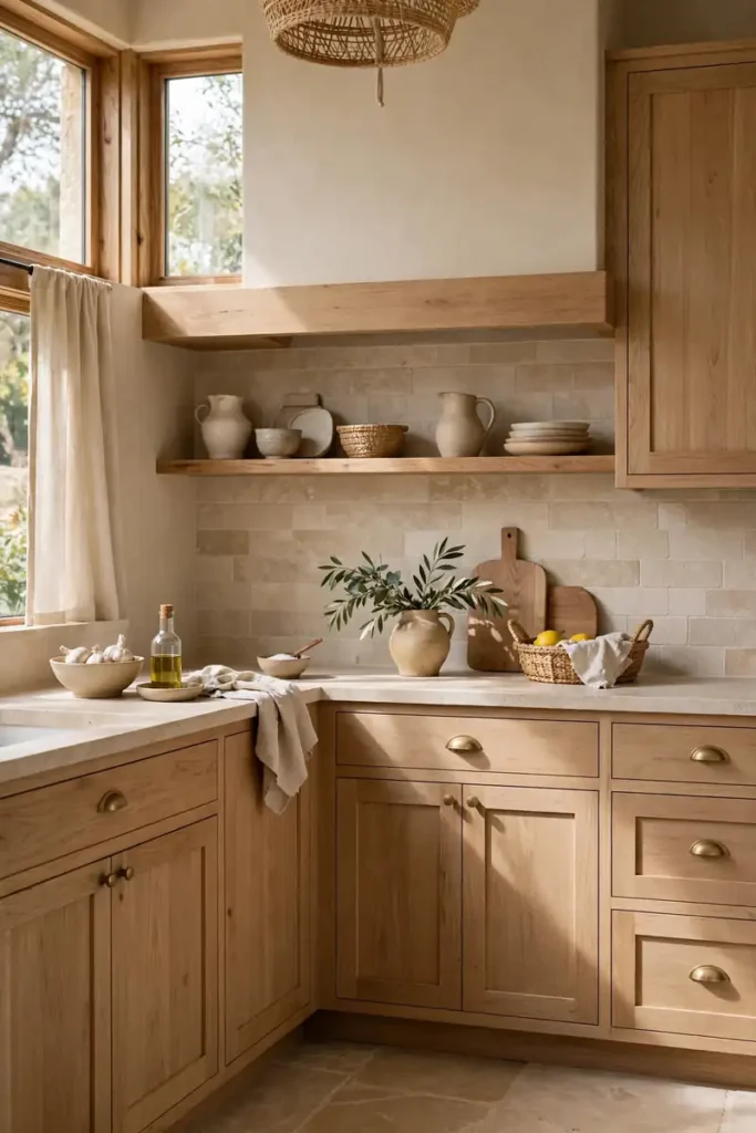
Renters inherit cabinet colors they did not choose. Paint is usually off the table, and the lease says so. Beige has to arrive through objects instead.
A beige Roman shade, a jute runner, and oatmeal-toned canisters shift the room without touching the cabinets. All of it leaves with you on moving day. Follow the package directions: adhesive strips hold light items on smooth paint and fail on textured walls.
Peel-and-stick backsplash tile works in rentals if the wall is smooth. It fails on textured paint, so test one tile behind the microwave first. See our renter-friendly upgrades for more swaps like these. The move-out rule: everything you add should leave without a trace, so keep original hardware in a labeled bag.
Beige Kitchen Hardware, Watched Over Time

Brass knobs look rich against beige in month one. By month twelve, unlacquered brass has darkened where fingers touch it most. Wipe-down people can carry black or brass. Wipe-rarely people should pick brushed nickel.
Dark bronze or matte black hardware acts as punctuation against beige. One dark finish on each handle snaps the cabinets into focus, the way a period ends a sentence. Test it on a single drawer first, since black reads stronger in person than online.
Budget the swap honestly. Knobs run about three to twelve dollars each, and a standard kitchen needs twenty to forty of them. Replace one drawer pull first and live with it a week. Cheap test, expensive lesson avoided.
Tile or Wood Underfoot
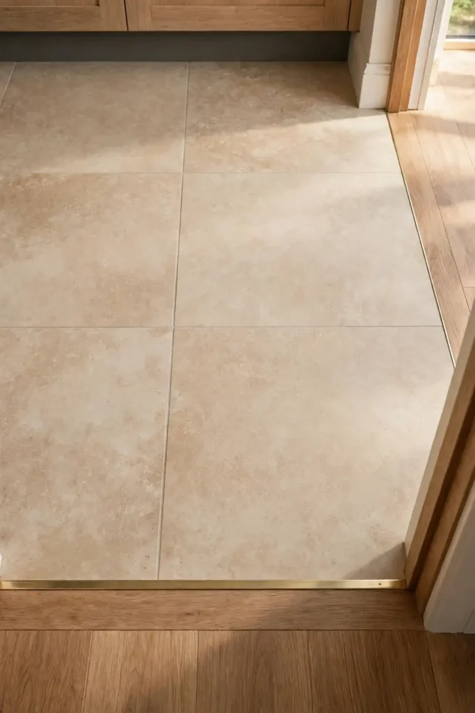
Beige cabinets over beige tile blur into one continuous surface. That works in a large kitchen and overwhelms a small one. A contrasting tile tone, even light gray, gives the cabinets a floor to stand on.
Wood floors pull beige toward the traditional side and feel better underfoot in winter. The tradeoff is water: wipe spills fast near the sink and dishwasher.
A runner fixes the middle ground either way. It adds pattern, protects the floor, and costs little. Pick one that leaves a few inches of floor visible on each side. In a small-space kitchen, lighter floors keep the footprint feeling open.
If a new floor is off the table, a large rug breaks the beige field instead. Choose a low-pile, washable rug near the sink.
Small Beige Kitchen, Borrowed Light
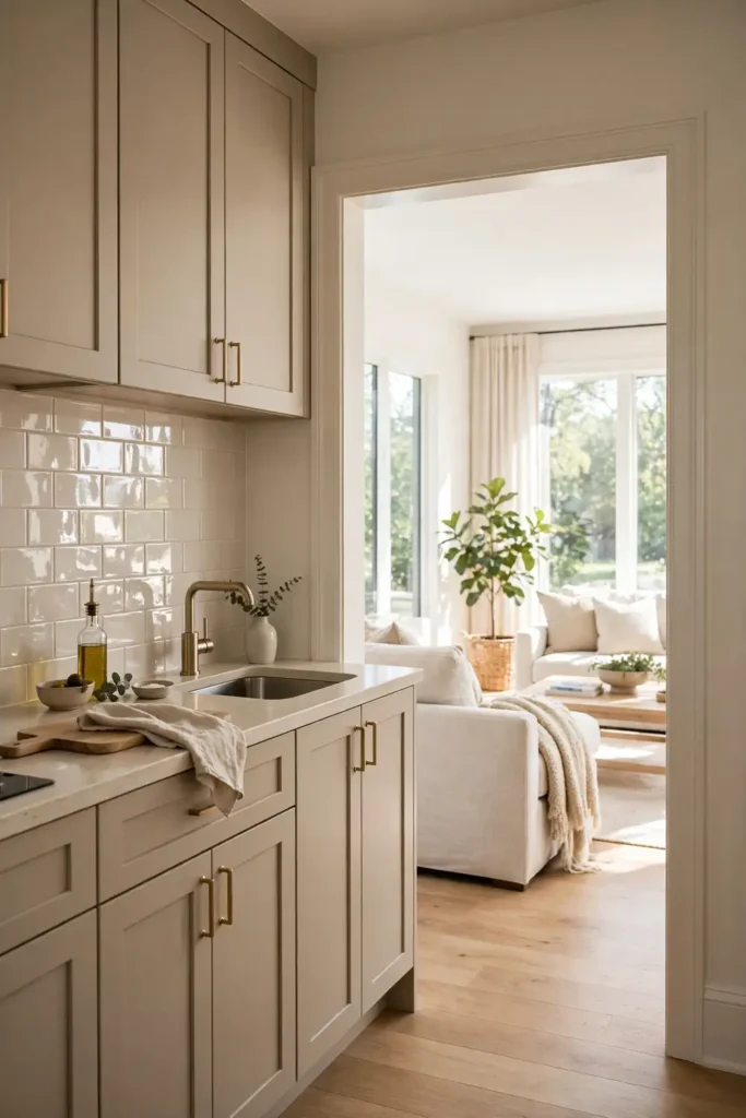
Small kitchens punish dark beige. One shade deeper than you planned can close the walls in. Go one shade lighter than your instinct, then add depth with objects instead of paint.
Borrow light with a mirror or a glossy tray near the window. Clear the counters to one appliance per stretch. Pale beige reads larger when nothing competes with it.
Glass-front upper cabinets help too. They break up the beige expanse and give the eye somewhere to land. Keep what is inside neat, since the glass shows everything.
A pale beige on the walls with a deeper beige on the lower cabinets adds depth without closing the room. Keep the uppers pale so the ceiling line stays high.
The Honest Beige Kitchen Starting List

Beige kitchens that work follow the same order: undertone first, light second, surfaces third. Start with two sample pots, one leaning yellow and one leaning gray. Tape both where the cabinets will be, and check them morning and evening.
Then choose the counter, the hardware, and the textiles in that order. Each layer narrows the field for the next one. That is how beige stays calm instead of turning into a compromise. For the full budget picture, budget makeover planning helps sequence the spending.
Write the undertone on the back of each sample board. Two weeks later the chips all look alike, and the note keeps you honest.
Final Thoughts on Beige Kitchen Ideas
This color rewards patience and punishes rushing. The shade that looks right on Saturday morning can look wrong by Sunday dinner. Only a sample lived with for two days tells the truth.
Buy two sample pots today and tape them where the cabinets sit. That single step costs less than lunch and prevents the most expensive mistake in this article.
Beige will not fix a dark layout or bad lighting. It will make a decent kitchen feel calmer and hold its look for years. That is a fair trade, not a miracle.
FAQ About Beige Kitchen Ideas
What beige paint color does not turn yellow on cabinets?
No beige is yellow-proof, since light changes how undertones read. Beiges with gray or greige undertones stay calmer than yellow-based beiges. The popular ones from Benjamin Moore and Sherwin-Williams are a safe starting point.
Is beige cheaper than white for a kitchen update?
The paint costs the same either way; the difference comes from prep and labor. A professional repaint commonly runs into the low thousands, while DIY supplies stay under two hundred. Beige saves money when it lets you keep your counters and floors.
How do I pick beige for a kitchen with little natural light?
Go one shade lighter than your first instinct, favoring a soft pink or neutral undertone over gray. Add under-cabinet lighting at 3000K to even out shadows. The chip means little here; only a sample viewed under your own bulbs counts.