Some rooms look put together and you cannot name why. Others collect objects and still look unfinished. The difference is styling, and styling is a set of moves you can learn.
These 15 living room decor ideas chase a look, not a feeling: rooms that read expensive without the budget. Each section says exactly where its dollars land.
Most moves cost little or nothing. Spend in priority order, and the room starts reading as considered, which is most of what expensive means.
Living Room Decor Starts With the Focal Point

Rooms without a focal point feel restless. The eye wanders from the TV to the window to the blank wall, and nothing wins. That restlessness reads as cheap, even when the furniture is fine. The wrong focal point is worse than none, so do not crown the room’s ugliest corner.
Pick one: the fireplace, the largest window, or the TV wall. Aim the seating at it, then let the styling support it. Art, shelves, and textiles all point back to that one spot.
Walk the room after dark; the focal point should still hold your eye when the light drops. A clear focal point is the fastest way to make a living room look designed.
Hang Art Lower Than You Think
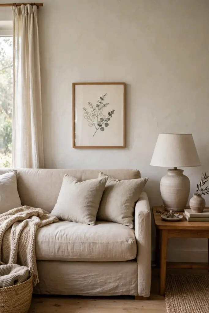
Galleries center art around 57 inches from the floor, a common guide. Most people hang it higher anyway, because holding a frame overhead feels natural.
The result is art floating near the ceiling, disconnected from the furniture below it. That advice is incomplete because it ignores the sofa.
Art above a sofa should relate to the sofa, not the ceiling. A hand’s width or two above the backrest is usually right. If the frame feels small once hung, it is. Take it down and size up.
Command strips work for light frames here, with the usual limits. Follow the package directions, respect the weight limit, and check your lease first.
One Large Piece Beats Five Small
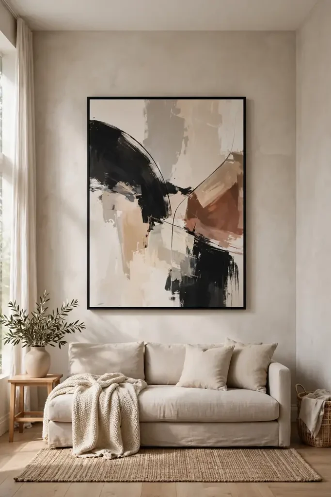
Five small frames scattered on a big wall look like apologies. One large piece looks like a decision. The eye trusts scale. This is where a tight budget wins.
One oversized print in an IKEA RIBBA frame costs less than five small framed prints. The honest limit is wall space. Measure first, because a large frame in a small room bullies everything else.
One wall gets the big piece; the other walls stay quiet. If you already own the five small frames, group them tight so they read as one unit. Either way, a $100 styling budget goes further on one statement than five small bets.
Style Shelves in Odd Numbers

Look at your shelf, then look at a styling photo. Yours holds books, a router, and remotes. The photo holds five arranged objects.
Style around the actual stuff instead of clearing it. Group the router and remotes in a small box or basket, then build around it in odd numbers. Three objects of different heights read as styled. Vary the heights on purpose, leave air between groups, and step back to check the balance.
Start with the biggest object, then add smaller ones in threes and fives. Stack books sideways to vary the heights. One shelf of books per unit is plenty; the rest should be objects, baskets, or empty space.
Pillows Are the Last Living Room Decor Purchase
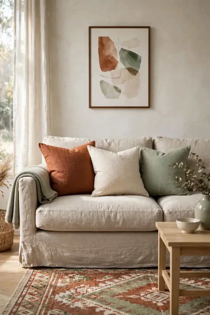
Throw pillows are the least important purchase in the room. They get bought first because they are cheap and fun. Then the room still looks unfinished, because pillows cannot fix placement, proportion, or light.
Buy them last, after the rug, the art, and the curtains are set. Then they do their real job: pulling colors that already exist in the room.
Target’s pillow covers suit this: cheap, washable, and simple to swap by season. The honest limit is the insert: a flat cover over the old sofa pillow still looks flat. Size the cover to a full insert. Fewer, better pillows beat a crowd, which is the minimalist instinct that keeps rooms looking rich.
Retire the free pillows that came with the sofa. Matching sets look like a showroom, not a home. Choose covers yourself in colors already in the room, and the set becomes yours.
Raise the Curtain Rod

Hanging the rod on the window frame is the mistake. It cuts the wall short and makes the window look smaller than it is. Most rentals do this, because the frame is where the brackets seem to belong.
Mount the rod a few inches above the frame and a few inches wider on each side. The window reads taller and wider, and the wall looks finished.
Floor-length panels complete the effect. Renters can do this without drilling. Tension rods fit inside deep frames, and adhesive hooks hold light panels if you follow the package directions.
Check the lease either way. These renter-friendly curtain fixes cost less than the panels themselves.
The window does double duty with a mirror. Hang it across from the window, not beside it, to bounce daylight back in. Beside the window it shows only wall; across from it, it doubles the light.
Swap the Shade, Not the Lamp
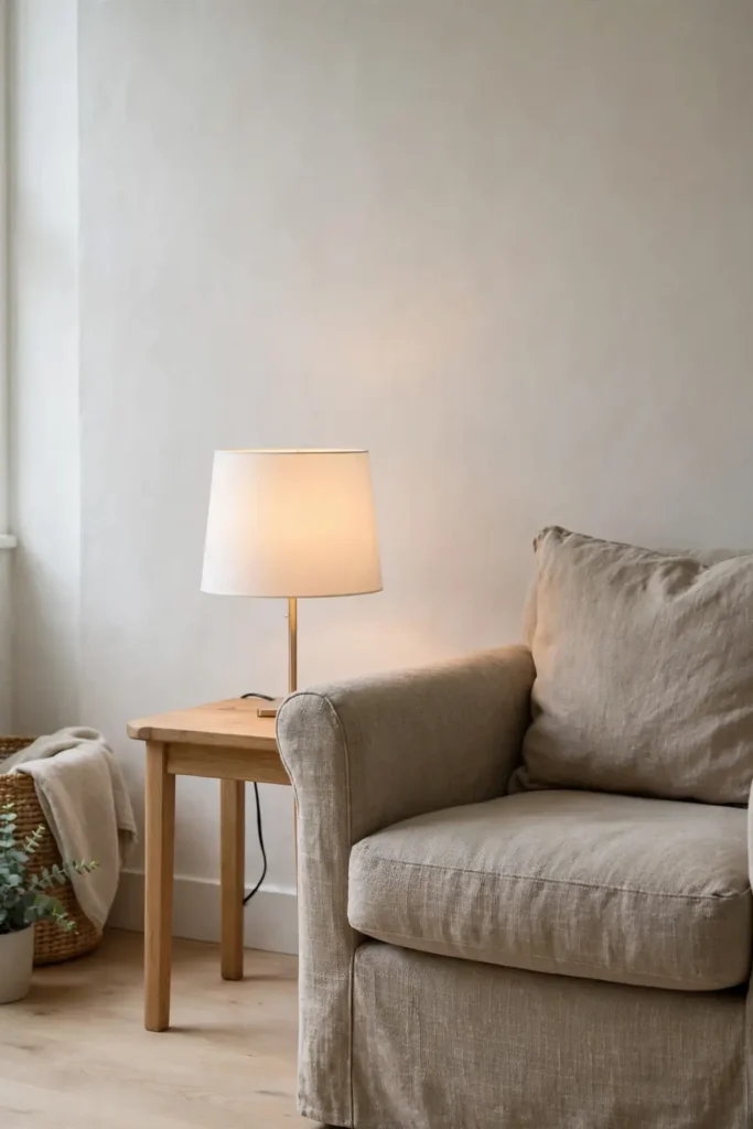
A dated lamp with a good base is a ten-minute fix. A new drum shade in white or natural linen updates the whole corner. The yellowed shade was the problem, not the base.
Match the shade size to the base. Too small looks cheap, too tall looks like a costume. The bulb’s color temperature matters more than the shade color. Swap the bulb to 2700K while you are at it.
Measure before you buy. The drum’s width should sit near the lamp’s widest point, and its height should cover the socket. A too-small shade is the mistake most people repeat. Bring the old shade to the store for scale.
Hide the Cord Clutter
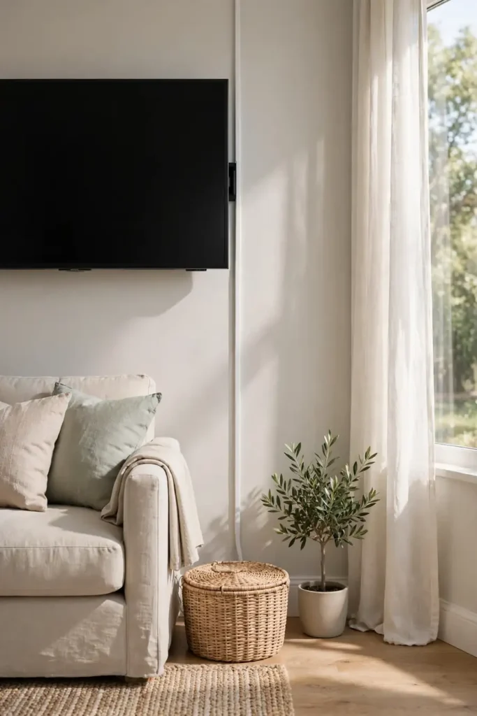
Nothing ruins an expensive look faster than cords. The TV wall, the lamp corner, the charger by the sofa. Each one is a small mess the eye finds right away.
People style the shelf and forget the floor. Bundle cords with reusable ties, run them behind furniture legs, and drop a cord cover where they cross the wall.
A basket beside the sofa hides the charging station entirely. It is a dull weekend project with an outsized payoff.
Mount a power strip to the back of the TV console with adhesive velcro. The plugs then live behind the furniture, out of sight.
Living Room Decor Has to Handle the TV
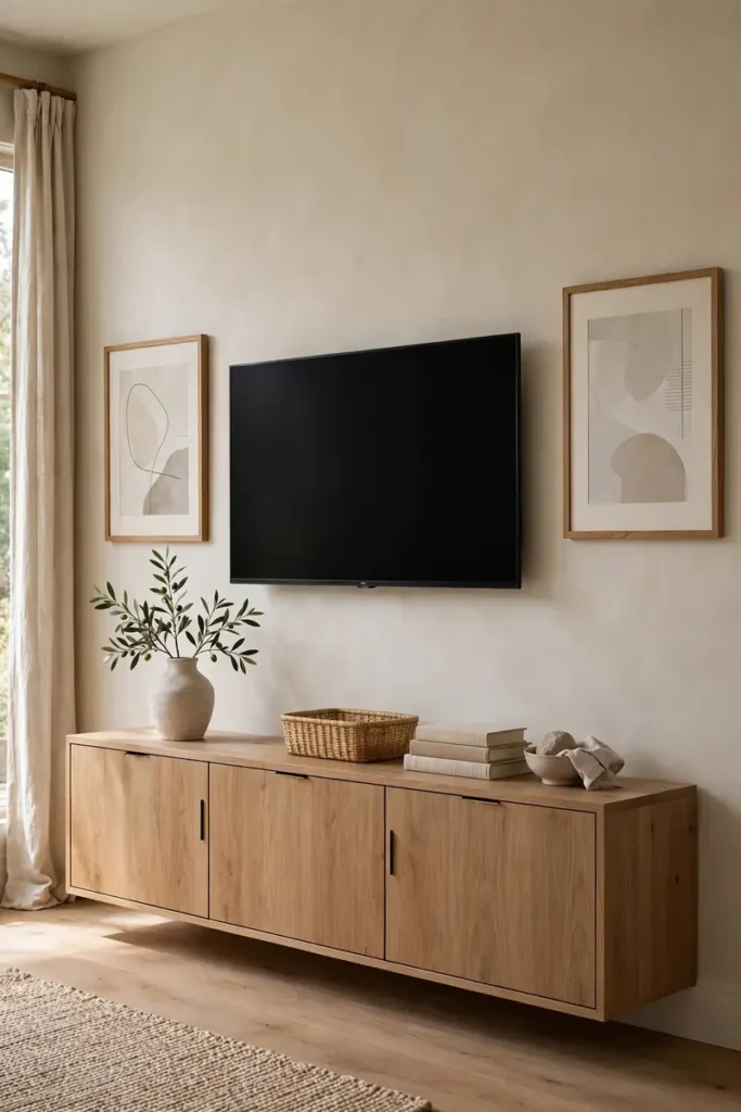
You cannot remove the TV, and you cannot make it pretty. That black rectangle is the hardest object to style in the room. Most styling advice pretends it is not there, which is why the advice fails.
Treat it as one dark rectangle in a larger composition instead. Flank it with art or shelves at the same height. It will read as part of a gallery instead of a hole. A console with closed doors underneath hides the boxes and remotes, and the frame around it stays calm.
Lower the screen to seated eye level, about 42 to 48 inches to the center. A high TV reads as sports bar, not sitting room. Tilt it slightly downward if the mount does not move.
Give the Coffee Table a Tray
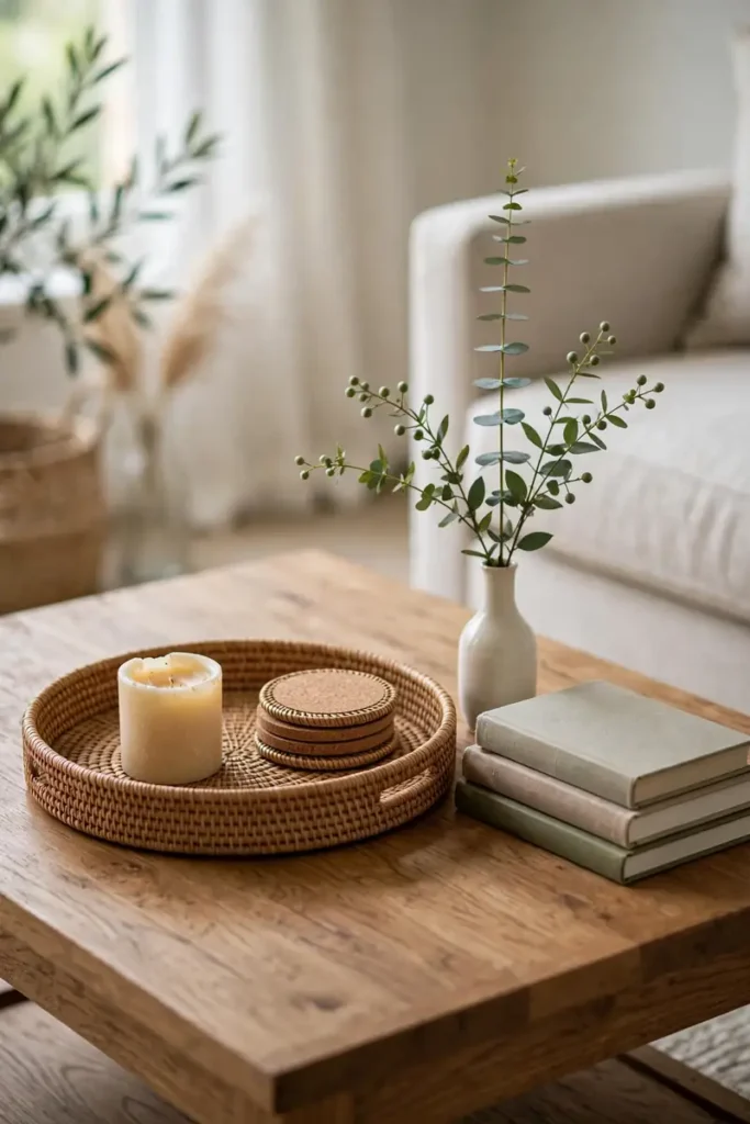
Before: remotes, coasters, mail, and a candle scattered across the table. After: the same items, corralled on one tray, with the candle and a small stack of books beside it. The table did not change. The reading did.
The tray is the border between styled and scattered. Everything small lives inside it; the table surface stays mostly clear.
But the tray alone is not the trick. One thing matters most: the object with height. A small vase, a candlestick, a tiny plant: something that breaks the flat plane of the table.
Without it, the arrangement reads as a desk. One tray, one stack of books, one object with height is the whole formula. These small living room upgrades cost little and read as considered.
Drape the Throw With Intent

A throw tossed on the sofa looks like laundry. A throw draped with intent looks like styling. The difference is thirty seconds and one fold.
Fold it in thirds lengthwise, then drape it over one arm or one corner of the sofa. Let one end hang longer than the other. It should look placed, not arranged. If it slides off daily, it is decoration fighting function, and function wins.
Choose a throw with some weight; thin fabric slips off within the hour. Wool or a heavy cotton weave stays where you put it. The throw you reach for most is the one that belongs on the sofa.
Size the Rug to the Sofa
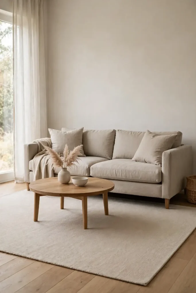
The fastest way to make a room look cheap is a rug that is too small. It floats in the middle of the floor like a postage stamp, touching nothing. This fails because the seating reads as separate islands instead of one group.
What works: a rug large enough that the front legs of the sofa sit on it, a common guide. The rug ties the seating together and gives the floor one continuous surface.
In a small-space living room, that usually means the largest rug the floor can take. Skip the tiny rug entirely and save for the right size.
Why Matching Sets Fail as Living Room Decor
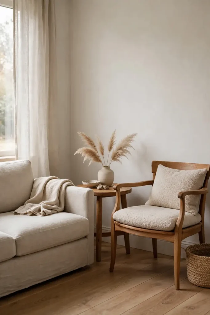
Matching sofa, loveseat, and tables look coordinated in the store and flat at home. Matching everything is the fastest route to a room with no personality.
Rooms that look expensive mix: a sofa in one fabric, chairs in another, tables in wood and metal. The mix reads as collected over time, which the eye reads as money. One matching pair is fine. A full set is a uniform.
You do not need to replace the set you own. Break it up instead. Move the loveseat to another room, and swap one end table and the lamps for mismatches.
Keep one thread of consistency so the mix holds: same wood tone, same metal finish, or one repeated color. Consistency in one place buys freedom in the rest. The room gets richer with each mismatch.
Cap the palette at three colors: one dominant, one secondary, one accent. Past three, the room reads busy.
Add One Tall Plant

One tall plant does more than six small ones. It draws the eye up, fills a dead corner, and adds a living texture no object can fake.
A snake plant or a tall palm in a simple pot is enough. The pot matters as much as the plant: a plain ceramic or woven basket pot looks deliberate. The plastic nursery pot looks temporary, so repot on day one. Dust the leaves monthly; dusty plants read as neglected.
The plant, the pot, and the soil stay under fifty dollars at most garden centers. Buy the pot first and the plant second.
Spend the First $100 Here
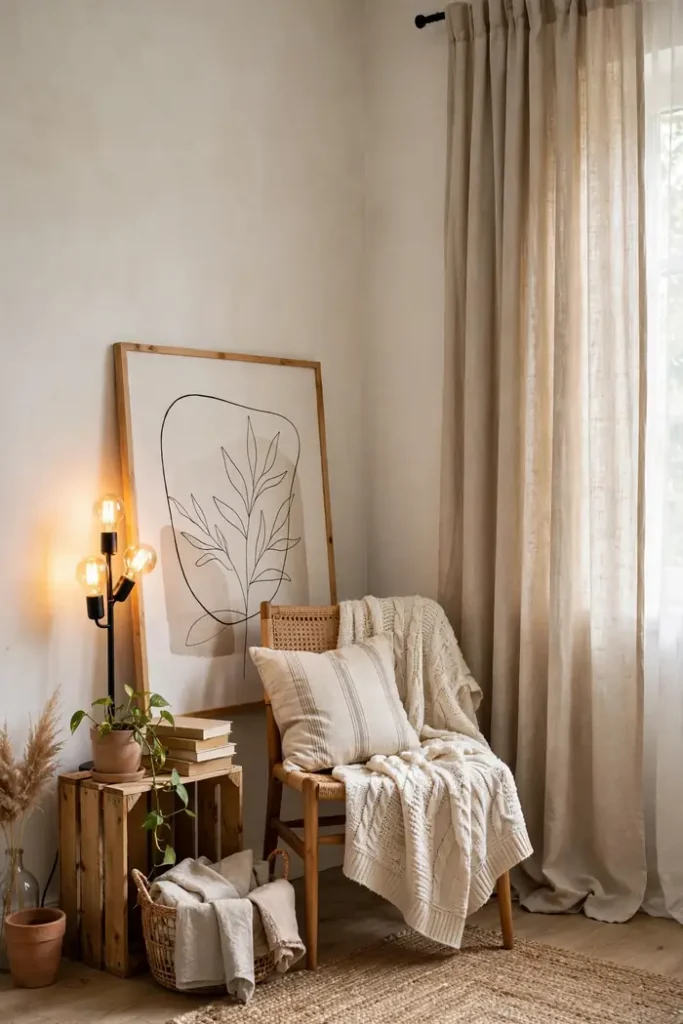
Watch where your eye goes when you enter a styled room. It goes to the brightest spot, the biggest textile, and the wall straight ahead. Money spent anywhere else goes unnoticed.
So the first $100 goes to light and textiles: 2700K bulbs, curtain panels hung high, one throw. The next $50 goes to the wall: one large print or a leaning mirror. That is the full $150 tier, spent in the order the eye notices. The full breakdown of the $150 tier is worth a look before you shop.
After the first $150, stop and live with the room for two weeks. The next purchase should solve a problem you can name. Most rooms need nothing more once light, textiles, and one wall are handled.
Final Thoughts on Living Room Decor Ideas
Expensive-looking rooms are edited and consistent. Restraint reads as money, and clutter reads as the opposite, at any budget.
Today, remove three things from the room. Not to be minimal, but to see what the room looks like with air in it. Then put back only what earns its spot.
Be honest about what styling will not fix. It will not fix bad proportions, a worn-out sofa, or a room with no natural light. It will make the room you have look considered, which is most of what expensive means.
FAQ About Living Room Decor Ideas
What size art goes above a sofa?
About two-thirds the width of the sofa is a common guide. One wide piece at that scale anchors the seating; two small pieces floating in the middle do not. When in doubt, go bigger than feels safe.
Can you mix wood tones in a living room?
Yes. Match the undertones: keep honey-toned woods with honey-toned woods, and gray-toned with gray-toned. Repeat each tone at least twice; one lone wood tone looks like a mistake.
What color sofa looks most expensive?
Mid-tone neutrals: greige, camel, soft charcoal. Very dark shows dust and pet hair, very light shows each stain. The color matters less than the fabric looking clean and the cushions holding their shape.